In this article, you will learn how to access and utilize the inventory reports group in JobyDesk.
Physical inventory represents a massive portion of your operational capital. Tracking it accurately ensures you never delay a job due to missing parts while preventing you from overspending on dead stock. By using these reporting dashboards, you can transform your warehouse operations into a tightly controlled, highly accountable, and data-driven system.
Accessing and Navigating Your Inventory Dashboards
In order to analyze your inventory data, you will need to access your reporting suite from the main navigation menu.
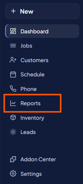
1. Navigate to Reports:
Click on the Reports tab located on your left-hand sidebar.
2. Open the Inventory Subgroup:
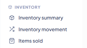
Drop down to the Inventory subgroup to view the three specialized dashboards:
- Inventory Summary: Provides a high-level snapshot of current stock levels and overall warehouse valuation.
- Inventory Movement: Tracks every single inbound, outbound, and manual adjustment event to provide complete accountability for physical assets.
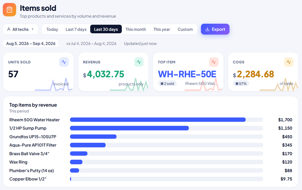
- Items Sold: Bridges the gap between your warehouse and your financial bottom line by ranking your top products by volume and revenue.
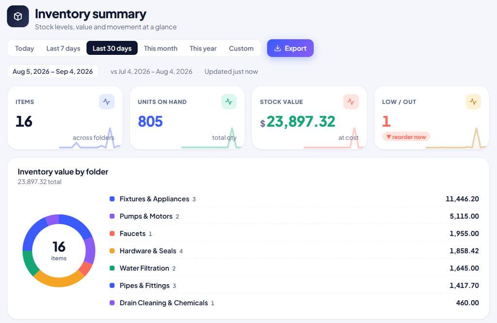
3. Review the Inventory Summary Dashboard:
Analyze your company-wide stock levels using the following tools:
- KPI Cards: Track your total unique catalog size (Items), aggregate physical volume (Units on hand), exact capital investment at cost (Stock value), and any items hitting minimum thresholds (Low out).
- Inventory Value by Folder Donut Chart: Visually review which product categories consume the most capital.
- Detailed Table: Search, toggle columns, and export exact item counts and valuations for every single folder in your system.
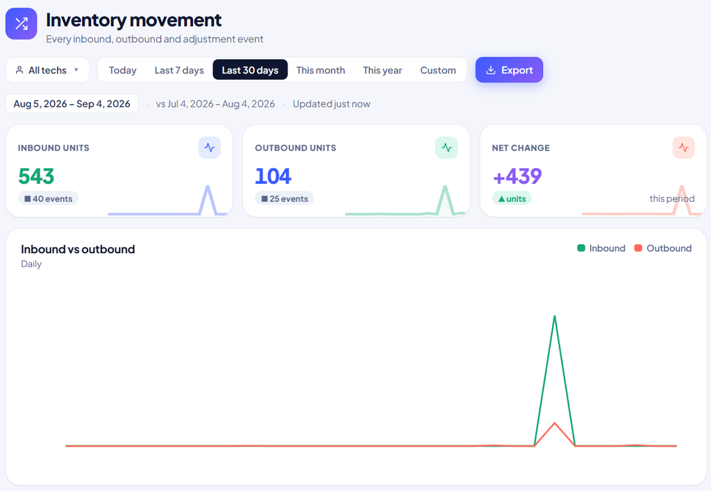
4. Review the Inventory Movement Dashboard:
Click into Inventory Movement to track where your stock is going.
- Technician Filter: Filter by specific technicians to audit individual truck stock.
- KPI Cards & Line Graph: Review total inbound units, outbound units, and net change, alongside an Inbound vs. Outbound daily line graph to spot unusual spikes in consumption.
- Detailed Data Table: Utilize the Inbound or Outbound filter tabs to scrutinize the exact date, time, quantity, and cause of every movement.
5. Review the Items Sold Dashboard:
Navigate to Items Sold to analyze product performance and profitability.
- Financial KPI Cards: Monitor total units sold on active invoices, total generated revenue from physical products, your top-performing item, and your Cost of Goods Sold (COGS).
- Horizontal Bar Chart: View a rapid visual hierarchy of your most lucrative items.
- Data Table: Review units sold, average price, total revenue, and exact profit margins by SKU.
These reporting insights empower your procurement team to negotiate better vendor pricing on high-volume items and help your sales team prioritize high-margin products.